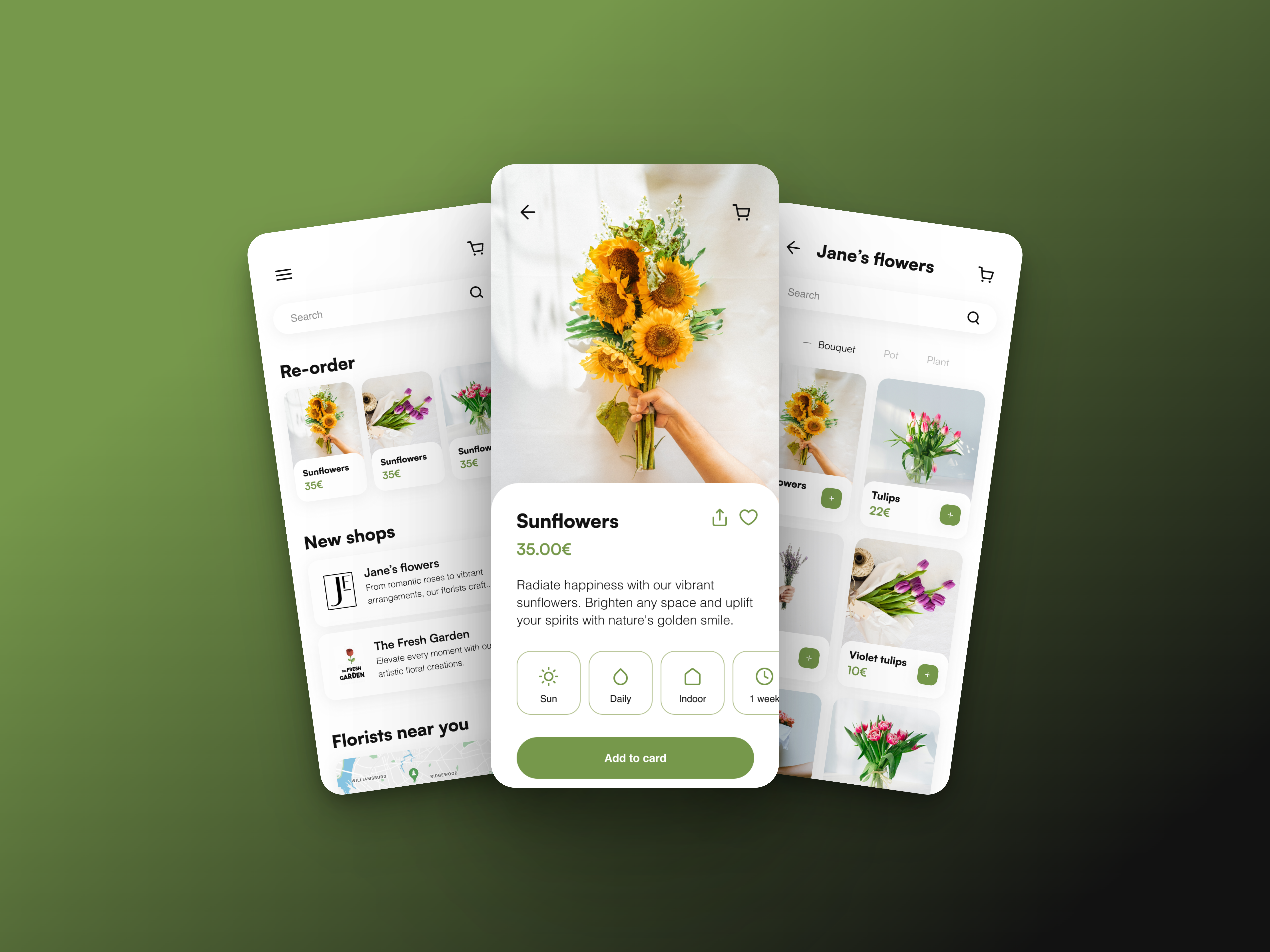
Flora

Flora is a mobile app designed to connect local florists with customers, providing a seamless platform for users to browse, select, and order fresh flower arrangements for delivery to their doorstep. This case study explores how Flora transformed the traditional florist experience, enhancing customer convenience and revitalizing local floral businesses.
Design thinking helped to provide a structured and human-centered approach to developing the branding strategy. It helps deeply understand the audience's needs and preferences, fosters creative thinking for unique solutions, and ensures that the brand elements resonate effectively. By following the design thinking process, we can create a branding strategy that's not only innovative but also tailored to the specific wants and emotions of the target audience.
Challenges
Local florists faced challenges in reaching a wider audience and adapting to changing consumer behaviors. The goal was to create an app that would:

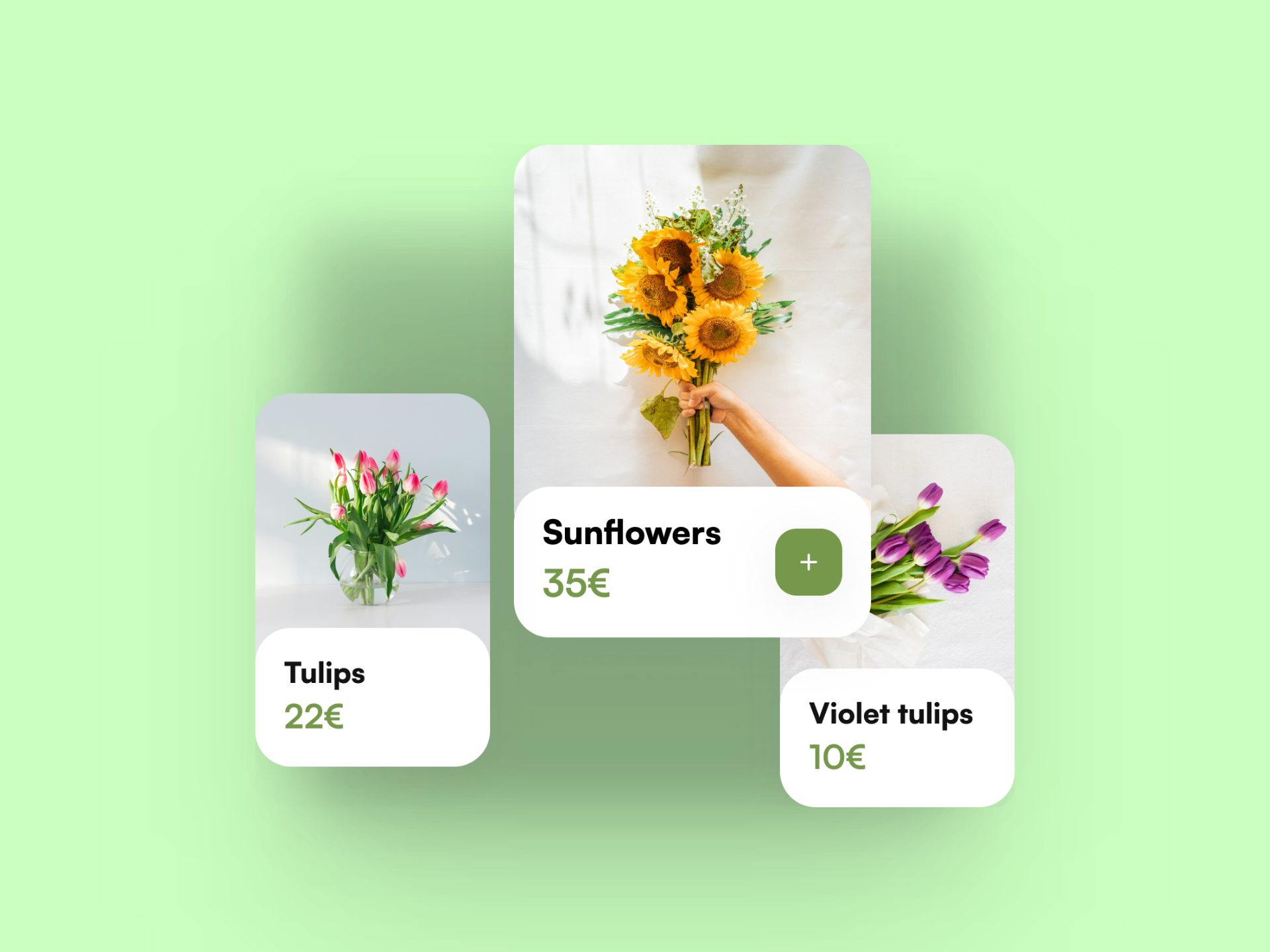
Increase visibility
Enable local florists to showcase their creations to a larger customer base.

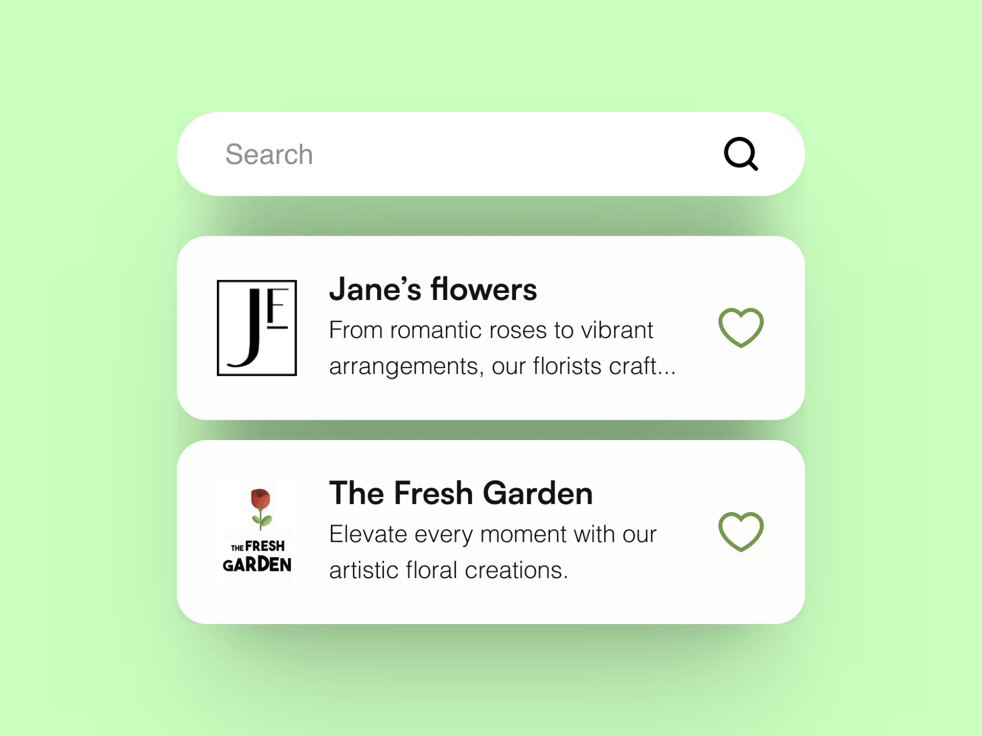
Streamline Ordering
Provide customers with an intuitive and convenient way to order flowers online.

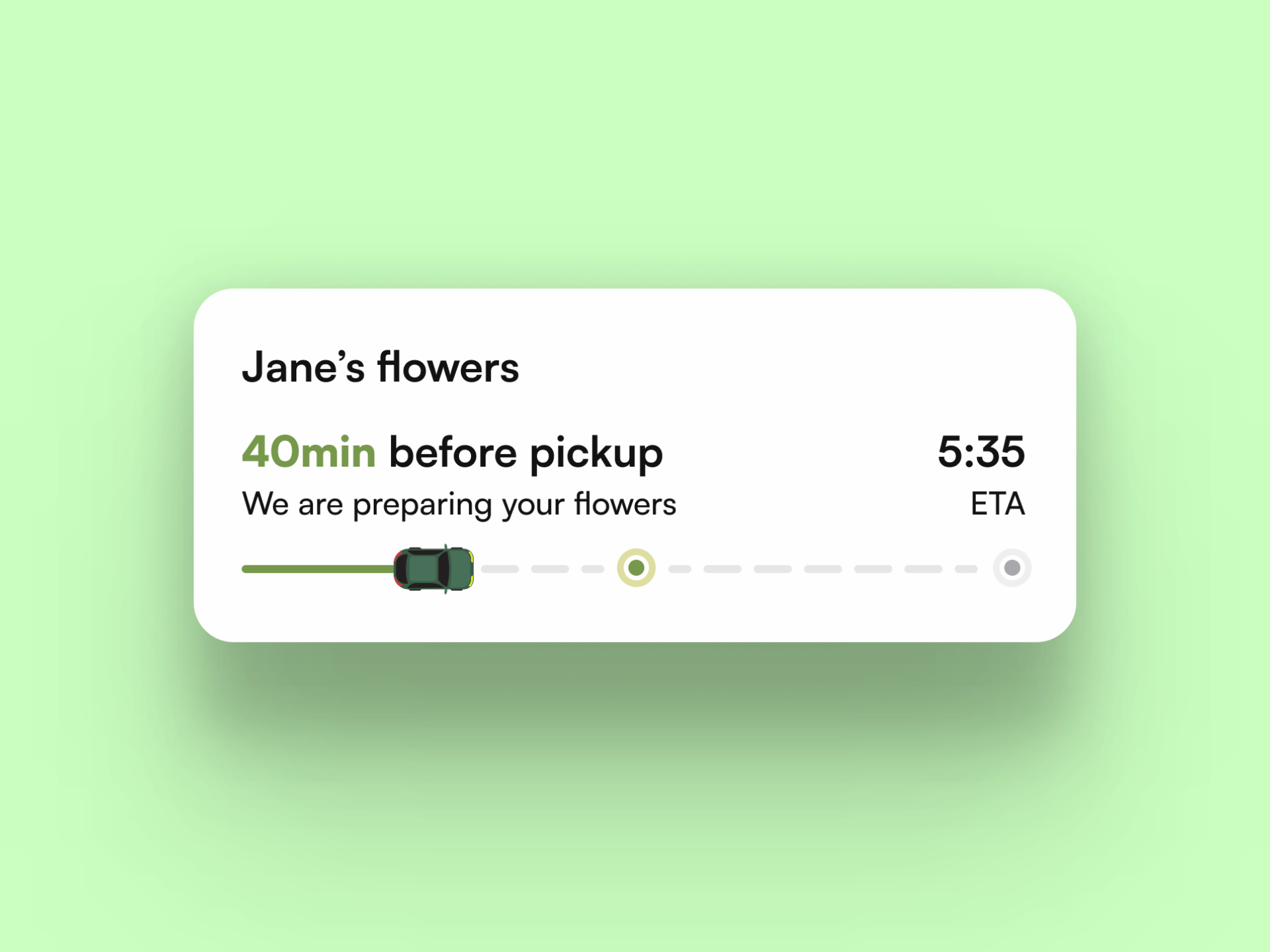
Facilitate Delivery
Implement a reliable delivery system to ensure timely and safe arrivals.

Solutions
Flora developed an app with the following features:
Accessibility
By prioritizing accessibility, we promote inclusivity, comply with legal requirements, broaden our audience, enhance user experience, and prepare for future technological advancements. Ultimately, digital accessibility ensures that technology is a tool for equality and participation for everyone.

WCAG recommandations
WCAG (Web Content Accessibility Guidelines) provide guidelines for making digital content accessible to people with disabilities.

Optimized navigation
Accessibility features facilitate easy navigation for all users, ensuring a seamless and inclusive digital experience.

VoiceOver features
VoiceOver is a screen reader built into Apple devices, enabling users with visual impairments to navigate and interact with the device using spoken descriptions.
Design system
Design systems are crucial for maintaining consistent and coherent design elements, fostering efficiency and a unified user experience across various products and platforms.
Satoshi
Abcde
Helvetica
Abcde
Let's talk!
You have a project in mind? Let's connect for a 15-minute free call to explore how we can bring your vision to life.